As a UX designer leading the redesign of TED.COM, I led all design initiatives. Throughout the project, I undertook a diverse array of responsibilities to ensure the success of the design.
20th February - 31st March 2024
(6 weeks approx.)
The current iteration of TED.com suffers from multiple deficiencies impacting its visual coherence, usability, and overall user experience. Key issues include inconsistencies in font styles and button designs, leading to a lack of synchronization across the website. Furthermore, inadequate text contrast hampers readability, while the absence of a logical hierarchy for font sizes contributes to a disjointed interface. Additionally, the website lacks visual appeal, lacking animations and smooth transitions, resulting in abrupt user interactions. Moreover, in dark mode, numerous contrast-related problems further degrade the user experience. These cumulative shortcomings diminish TED.com's effectiveness as a premier platform for intellectual exploration and inspiration. Therefore, the redesign of TED.com aims to rectify these issues comprehensively, ensuring a cohesive, visually appealing, and user-friendly interface that fosters engagement and enhances the overall browsing experience for users.

When hovering over certain elements, there is no feedback to indicate that the mouse is on the element, leaving the user unsure if the element is interactive or not... Like in this scenario the button has no indication to suggest whether it is clickable or not.
Lack of Visual Feedback
While hovering over the content there is no percievable visual feedback for the User.


Poor Transition
The transition between pages is too sluggish and lacks smoothness, making the loading experience jarring for the user.
Poor Animation
The animation indicating interaction with the video card lacks appeal and doesn't stand out..

Contrast Fail
In dark mode, the "WATCH NOW" button fails the contrast ratio, making it almost invisible and difficult to notice or click.
DESIGN PROCESS
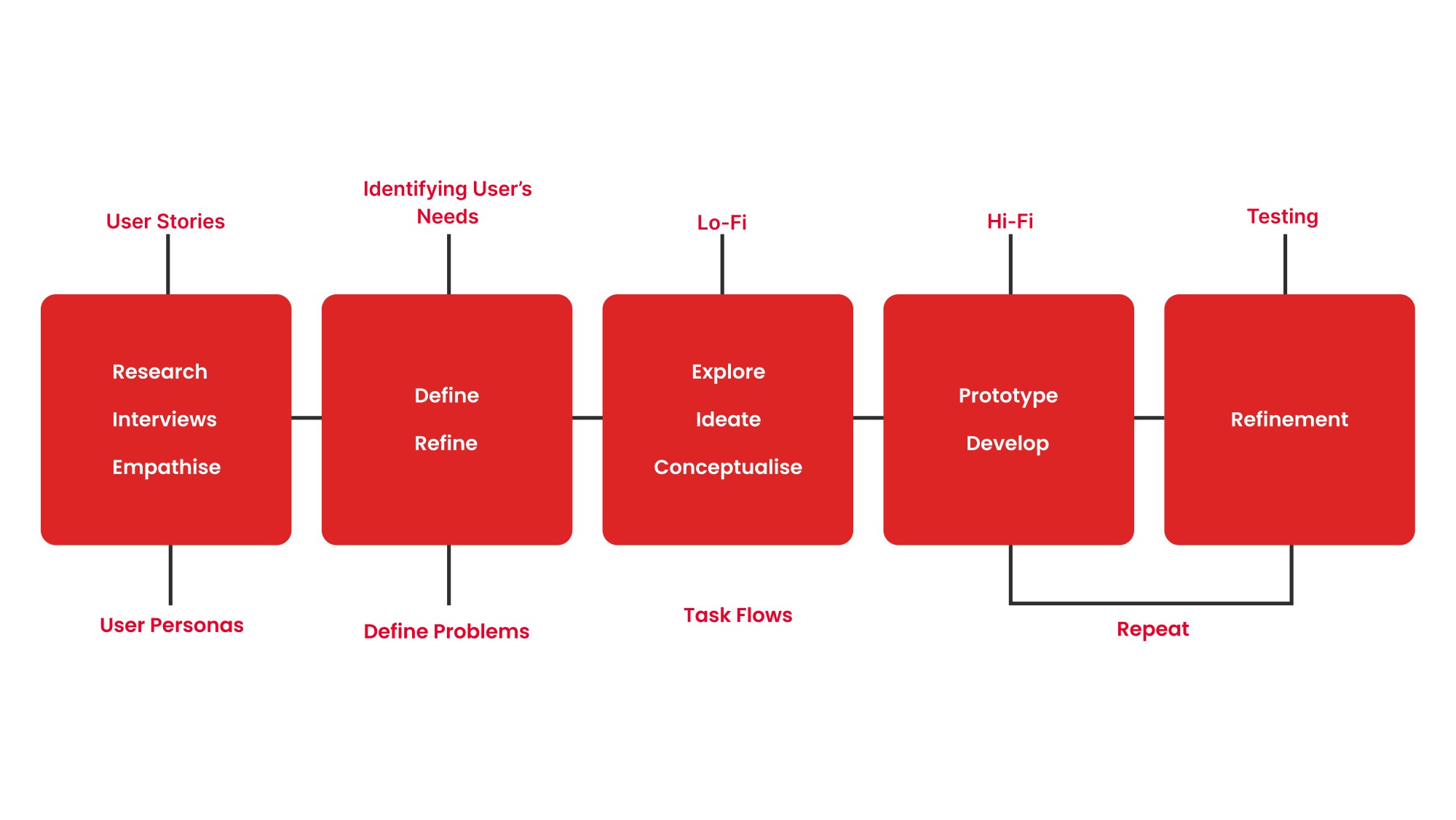

UNDERSTANDING THE USER
Souvik Pradhan
March 2024
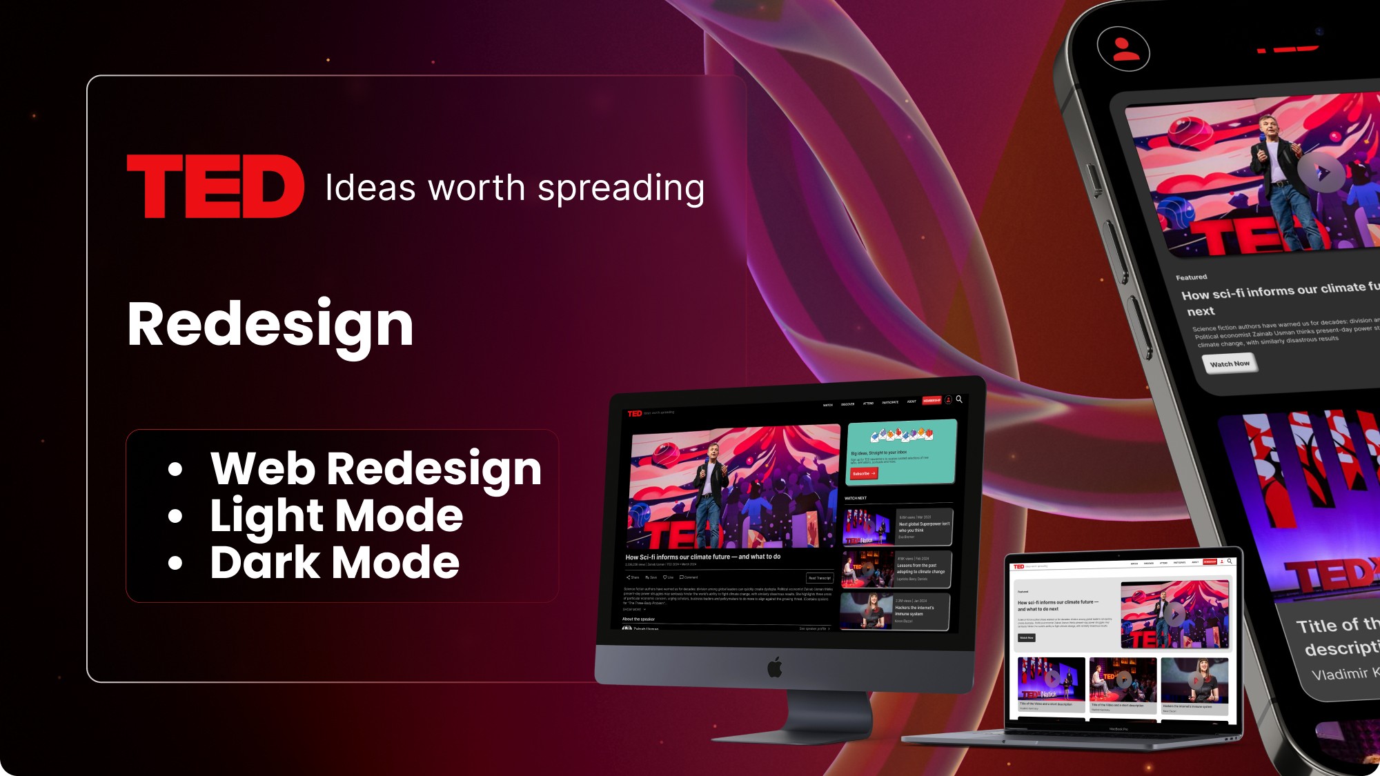
TED.COM REDESIGN

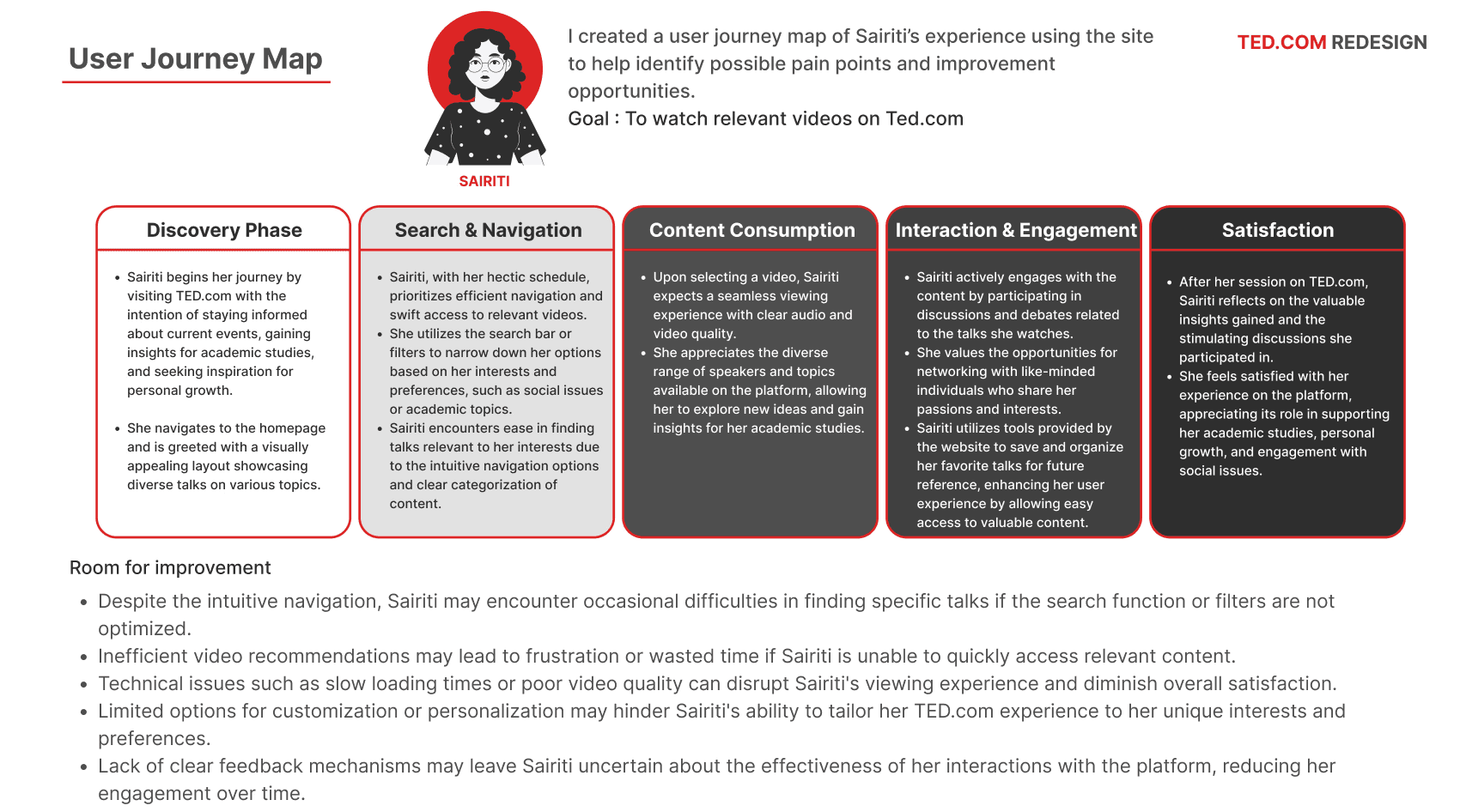
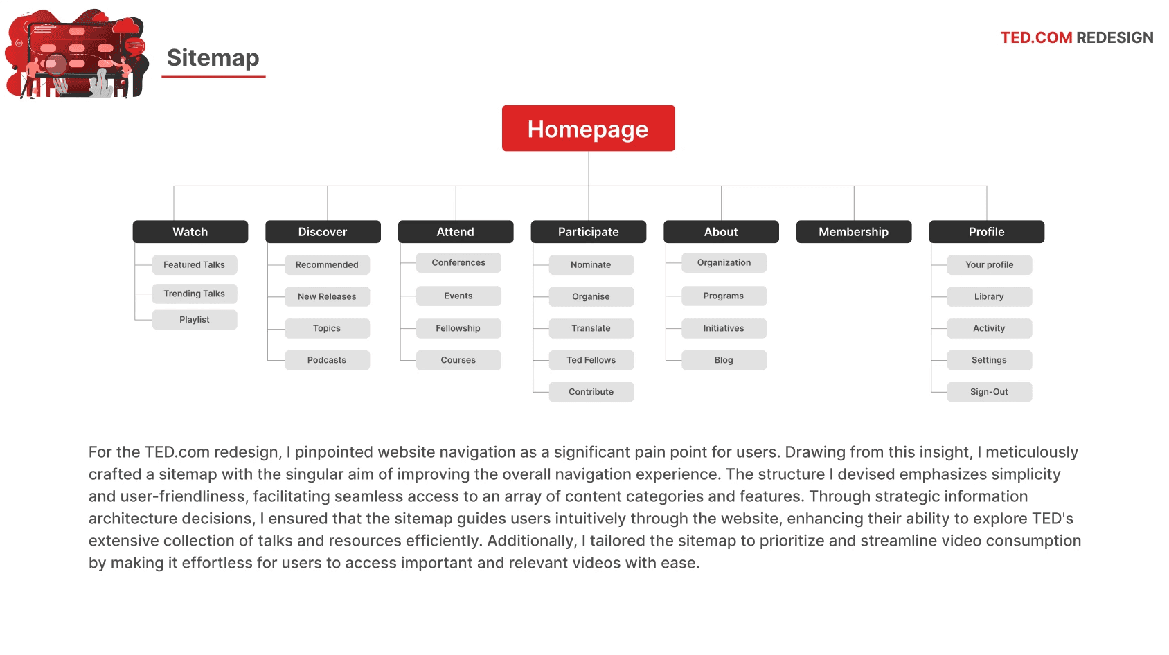
The user research conducted for the Ted.com redesign project encompassed a multi-faceted approach, including in-depth user interviews to delve into motivations, preferences, and pain points of regular users
Usability testing was utilized to observe user interactions, pinpoint usability issues, navigation challenges, and areas ripe for enhancement. Additionally, an in-depth analysis of website data through analytics review provided valuable insight into user behavior, popular content, and traffic patterns on TED.com. This comprehensive research methodology allowed for the reassessment of initial assumptions, ensuring that the redesign strategy aligns closely with actual needs and behavior of the platform’s users.
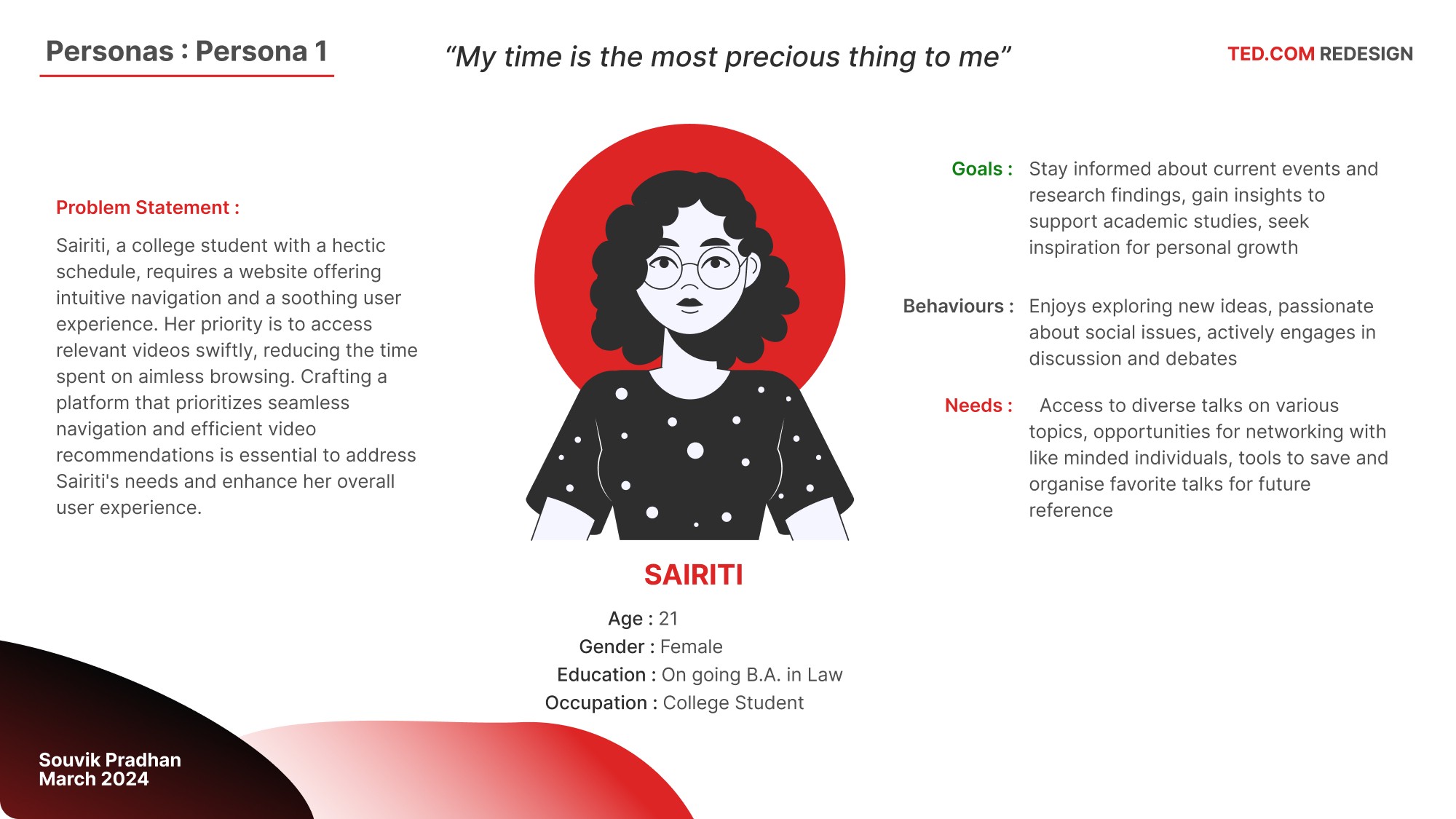
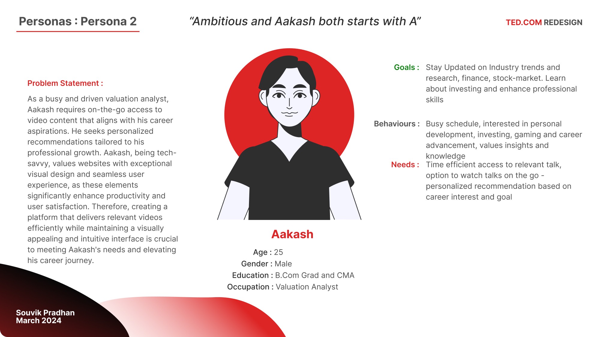
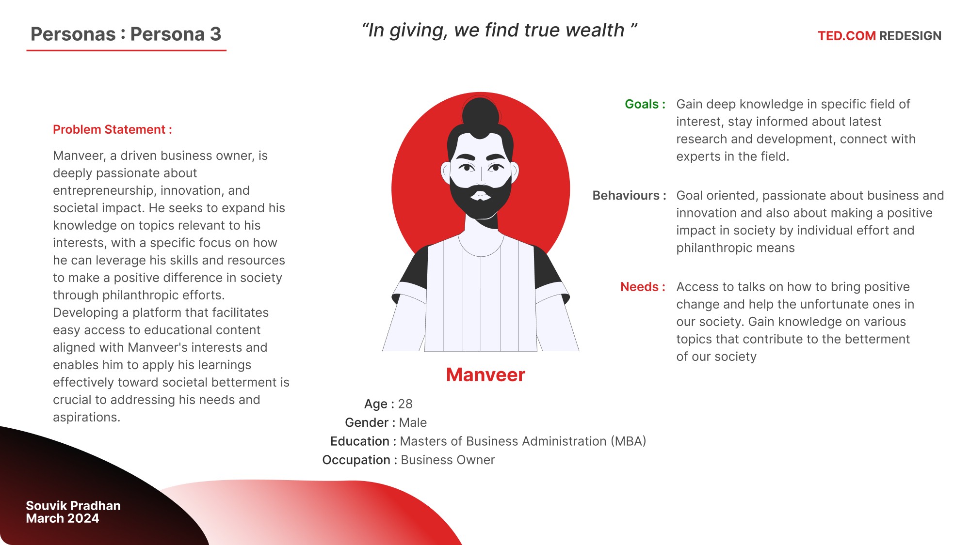
Target Audience
Young Adults (18-24): College students and early-career professionals looking for inspiration, educational content, and fresh ideas to shape their future paths.
Adults (25-34): Individuals who are further along in their careers, seeking innovative ideas, professional development, and intellectual stimulation.
Mid-Career Professionals (35-44): Those looking for deeper insights, new perspectives to enhance their careers, and content relevant to their professional and personal growth.

PAIN POINTS
Souvik Pradhan
March 2024
TED.COM REDESIGN
1
Navigation
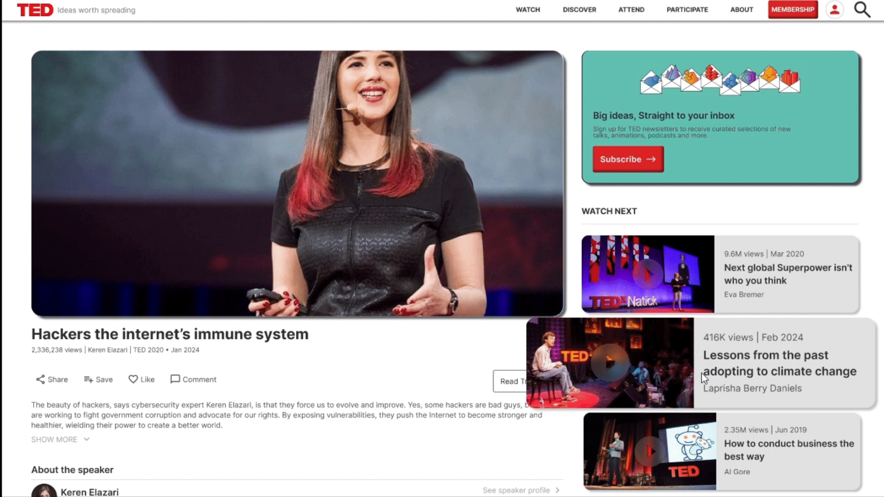
One pain point in the current TED.com design is the lack of uniformity in the top navigation bar. The layout and size of the navigation bar vary inconsistently across different sections of the website, leading to a disjointed user experience. Additionally, the fonts and buttons lack synchronization, with font weights representing importance, causing confusion in identifying clickable elements. In dark mode, button text lacks legibility and contrast, further complicating navigation and user understanding. Moreover, the videos on the website lack visual cues indicating their clickability, diminishing user engagement.
2
Interaction
A significant pain point on TED.com is the lack of motion cues or feedback to indicate user interactions. The absence of visual cues makes it challenging for users to discern whether an interaction has occurred, especially since most motions are instant Transitions lack smoothness, appearing abruptly. Additionally, the absence of feedback on user interactions diminishes user engagement and satisfaction with the platform.
3
Experience
One pain point of the online video viewing website is its lack of an engaging and satisfactory browsing experience. Issues with the password form and profile picture icon contribute to user confusion and frustration. The absence of a loading animation and inconsistent font sizes further detract from the user experience. Moreover, the sharp edges on video cards strain the eyes, making content consumption less comfortable. Additionally, the overwhelming layout and information on the website make navigation and content discovery challenging for users.


TED.COM REDESIGN
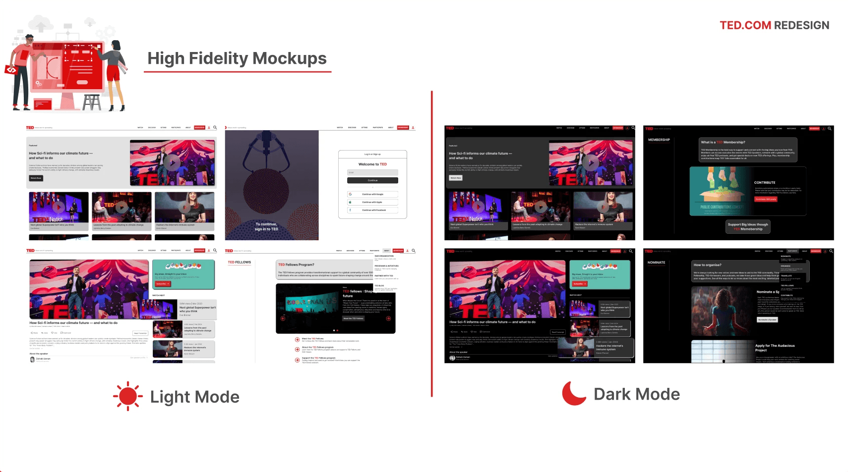
High Fidelity Mockups
Old Design
No responsive feedback on the BUTTON while hovering
New Design

Button on the cards are also made interactive while hovering
Old Design
No responsive feedback is present on the content while hovering
New Design

While hovering, the content smoothly zooms in, providing interactive feedback.
Old Design
The transition between pages is too sluggish and lacks smoothness, making the loading experience jarring for the user.
New Design

The transition animation is made smooth and a smart animation is added to it, making the experience pleasing for the user
Old Design
The animation indicating interaction with the video card lacks appeal and doesn't stand out..
New Design
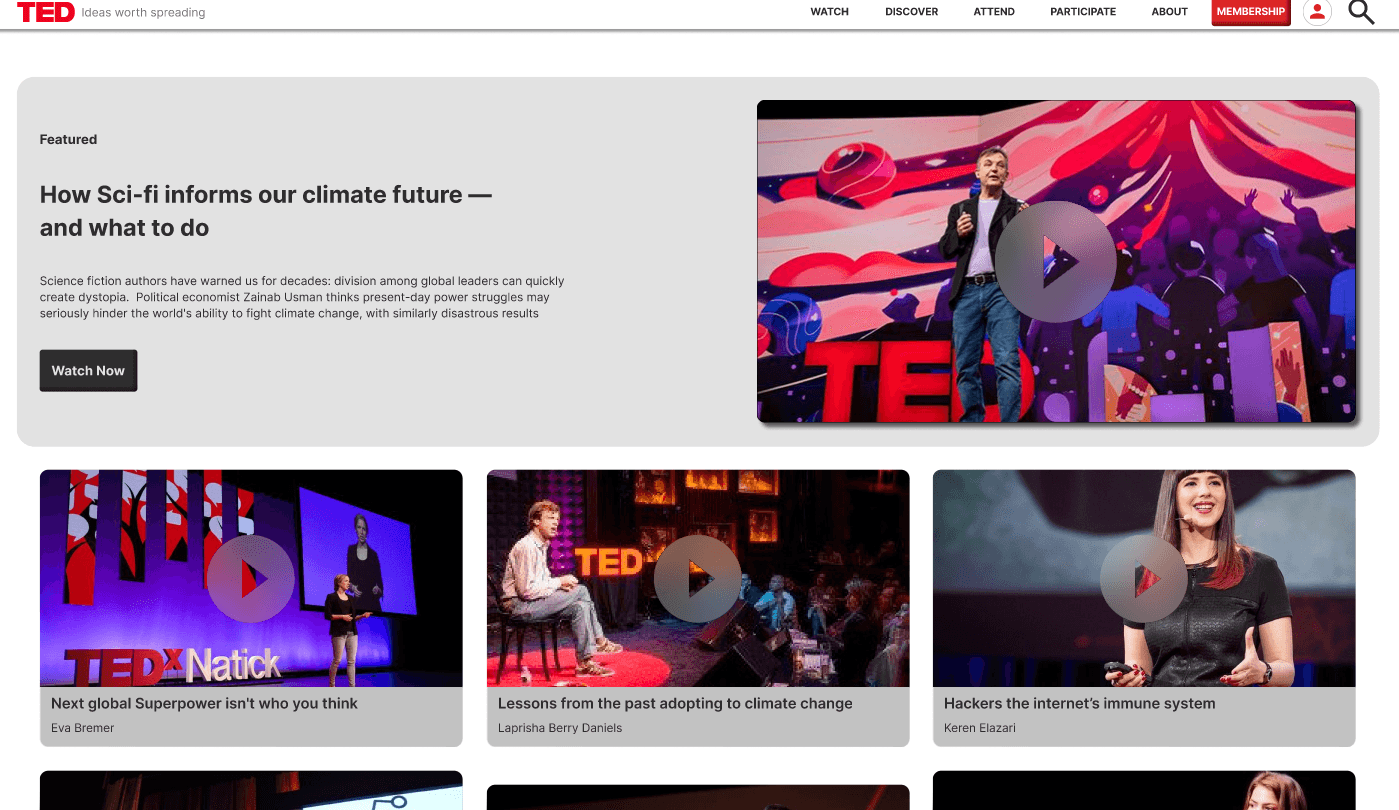
An eye-catching animation is added to the content cards, making them stand out.
Old Design
In dark mode, the "WATCH NOW" button fails the contrast ratio, making it almost invisible and difficult to notice or click.
New Design

In dark mode, the "WATCH NOW" button’s contrast ratio is fixed and an interactive animation is also added on the button, while hovering
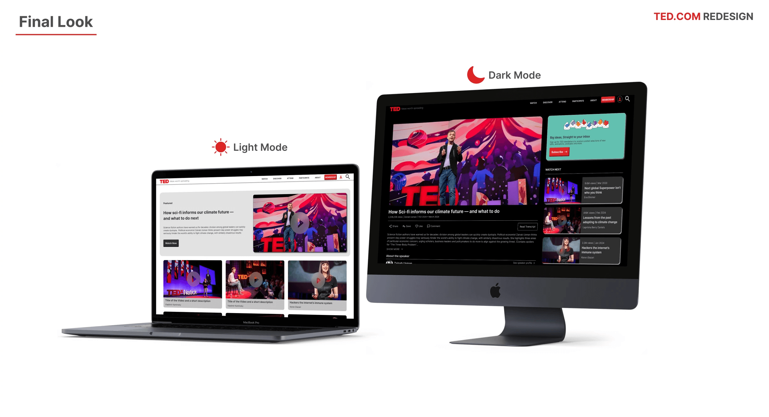
Things added to the New Design
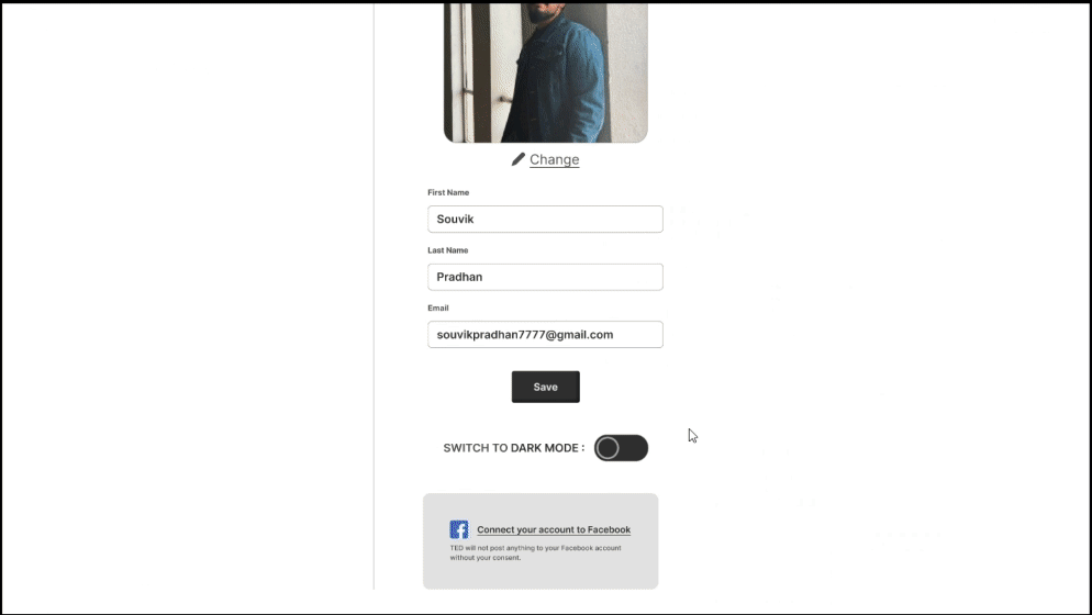
We can now seamlessly switch between Light Mode and Dark Mode on the website.

An eye-catching animation is added to the content cards, is also present in the Dark Mode

The Navbar contents have been updated to improve content discoverability. The cards feature rounded edges, creating a visually pleasing and user-friendly design, making it easy for the user’s eyes_

All smooth animations and interactions have been added to Dark Mode as well, ensuring proper contrast ratios are maintained.

Screen Size Variations
Desktop/Laptop
Tablet
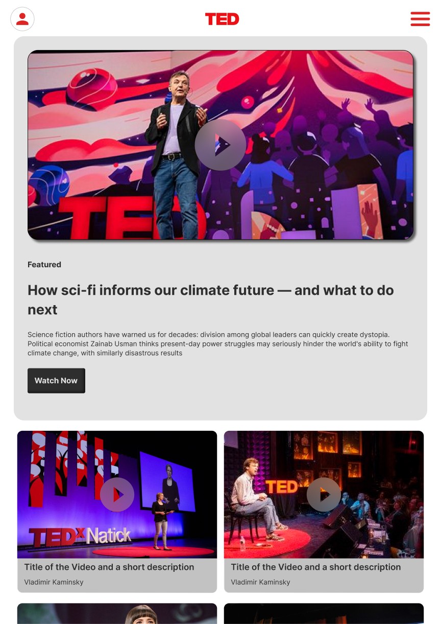
Mobile